The red style is simply the secondary button in red. Sign out briefly had its own custom design; I sent it back, because the system already had the answer.
Case study · The Hectre · October 2026
A design system that means what it says.
I'm Birthright, cofounder and Lead Designer at The Hectre, an app that helps people in Nigeria and the UK find housemates and shared homes. In October I rebuilt our design system: the shared set of colours, type, components and rules that every screen is built from.
This page walks through the nine decisions that shaped it, and why I made them. Most come with a small live demo. They play on their own; hover over one to take control.
- Role
- Cofounder, Lead Designer
- Responsible for
- Genesis 2.0, the Figma file, the rulebook, and the final call on every screen
- When
- 9 to 20 October 2026, in five reviewed stages
- Built with
- Figma, Next.js, Tailwind v4
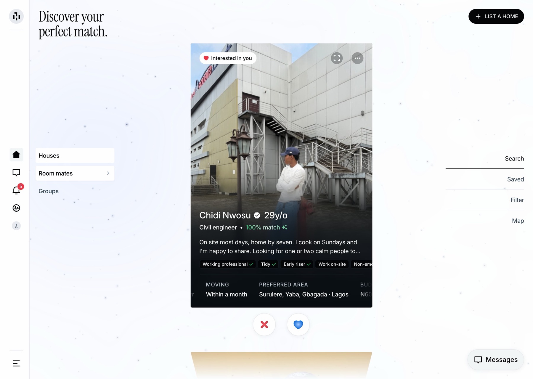
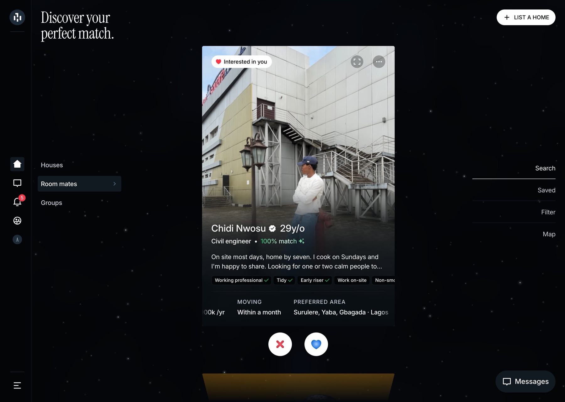
Why it mattered
Strangers, one roof
The Hectre asks people to move in with someone they met through an app. For that to feel safe, people need to believe what the screen tells them: that someone is verified, that a room is available, that a match is a good one.
That trust has to start inside the product. When I took a hard look at our design files, they weren't in good shape. They mixed three different design libraries, about 3,100 settings pointed at them, and some colours had names that said the opposite of what they were.
The build in this case study is for Nigeria, so it also had to feel local: prices in Naira with the rent period always shown (₦850k /yr), dates written DD/MM/YY, and Nigerian phone numbers. So I set one goal for the rebuild. Every name, colour and label should mean exactly what it says.
Decision 01
Make the names honest
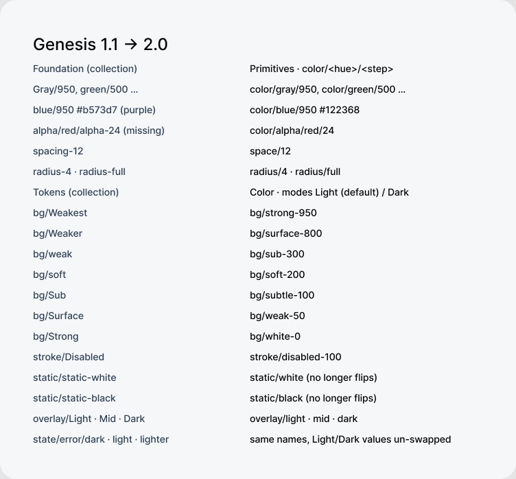
In a design system, every colour has a name, so designers and engineers can say "use this one" without quoting colour codes. Ours had names you couldn't trust. The darkest background was called "Weakest", the white one "Strong", and a colour named blue was actually purple.2
I replaced them with names that carry their own meaning. Each says what the colour is for, then where it sits on a grey scale from 0 (white) to 950 (near black). So bg/subtle-100 is a background near the light end. Once you know the pattern, you can read any colour from its name. Use the switch in the demo to compare the old names with the new ones.
From the rulebook
Every colour name says what it's for and where it sits on the grey scale. If a name and its colour ever disagree, the name is fixed first, in the design file.
Decision 02
Use the same names in design and code
This is the decision I care most about, even though no user will ever see it. Every colour, text style and icon has exactly the same name in my design files as in the code.
When design and code use different words for the same thing, they slowly drift apart, and small inconsistencies creep into every screen. With one shared set of names, a note like "use subtle-100 here" means the same thing to everyone, in both light and dark mode.
| What | In my Figma | becomes | In code |
|---|---|---|---|
| Colour | bg/subtle-100 | → | bg-subtle-100 |
| Colour | text/sub-600 | → | text-sub-600 |
| Colour | stroke/soft-200 | → | border-soft-200 |
| Modes | Light · Dark | → | data-theme="light" · "dark" |
| Text style | Label/Medium | → | text-label-md |
| Text style | Title/Serif Display | → | text-display-serif |
| Radius | radius/12 | → | rounded-12 |
| Spacing | space/12 | → | p-3 |
| Icon | check-line | → | <RiCheckLine /> |
One source for every value
Every value lives in one file that mirrors my Figma library. A small script turns that file into the code the app uses, so nobody ever types a colour by hand. To change a colour, you change it in Figma first and it flows through to every screen. The demo shows it: as the value changes, the code and both screens update together.
Light
you@example.com
TidyEarly riser
Find a roommate
Team up and rent together.
Team up and rent together.
Dark
you@example.com
TidyEarly riser
Find a roommate
Team up and rent together.
Team up and rent together.
A mistake, and how the process caught it
The demo's "My first mistake" button replays a real slip. While moving to the new system, I merged two greys that look identical in light mode. In dark mode they're clearly different, and dark is our default. I caught it, and the fix took one line:
- FigmaI added the missing grey back in Figma
Light grey in light mode, dark grey in dark mode, named by the same pattern as every other colour.
- SourceOne line in the source file
"bg/subtle-100": ["gray/100", "gray/800"] - GenerateThe script regenerated the code
Everything else came out exactly as before. Only the new colour was added.
- TodayThe most used surface in the app
It's now the background behind every text field, tag and option card in the app: 90 places in the code.
566places the code uses a named colour
202places it uses a named text style from Figma
48icons with the same names in Figma and code
26hard-coded colours left, all deliberate3
Where it's still manual. I'd rather be clear about this. Colours and type stay in sync through the shared file. Layouts don't: for every screen I've designed, the build is checked against my Figma design by measuring it in the browser. Linking each Figma component directly to its code is the next step.
Decision 03
Don't hide what doesn't fit
Moving every design file onto the new system meant reconnecting about 3,100 settings. Most were easy to match, so I did those first, which left only the hard ones at the end.
799matched by name, with no visible change
~2,300matched by purpose and closest colour
4colours left as they were, on purpose
76icons rebuilt for the new library
Four colours had no honest match in the new system. Forcing them onto the closest one would have quietly changed how parts of the product look, without anyone deciding to. So I left them alone and listed them as open decisions, to settle when those parts are redesigned.
#17171714
card shadow
card shadow
#006b99
blue/darker
blue/darker
1% black
pill inactive
pill inactive
#e25d1a
company orange
company orange
Decision 04
Tune each theme on its own
The Hectre is dark by default, set against a faint night sky. It also has a light mode, and I didn't want it to feel like dark mode with the colours flipped. Every colour in the interface switches between the two; nothing is hard-coded white or black.
Shadows showed the problem first. I'd tuned them on a dark background, and on white they looked far too heavy. Now there are just five shadow styles, each with a much softer version for light mode. The demo shows both on white.
control
panel
lifted
Fixes that only light mode needs
Some problems only exist in one theme. In light mode, grey panels over the sky's coloured glow looked muddy, so they turn pure white as your pointer comes close. Watch the menu in the demo, or move your own pointer near it. It's a small thing, but I think small things like this are most of the job.
HousesRoom mates Groups
pointer from the tabs · white within 200px
Two things deliberately ignore the theme, and both are written down as exceptions. Text on a photo is always white on a dark fade, because photos don't change between modes. And a person's profile card always stays dark.
From the rulebook · 12 Oct
Shadows come in five named styles, each with a softer version for light mode. Nobody invents a new shadow on the fly.
Decision 05
Take the edges off
The first build copied my early app designs exactly: sharp 4px corners and thin outlines around everything. Seeing it in the browser, it felt too sharp. On 10 October I changed the shape of the whole product. The demo goes from that first version to what we shipped; hover to try your own corner size.
you@example.com
Find a placeA room in an existing home.
Send code
I gave each kind of corner a job. Text fields, lists and panels get a soft 12px corner. Photo cards keep the crisp 4px corner from my original design. Buttons and tags are fully rounded. Each value is set in one place, so changing it updates the whole app.
Swapping outlines for soft grey fills caused a knock-on problem. Our secondary button is the same grey, so on a grey panel it disappeared. I added a slightly darker "raised" button for those cases, and wrote both changes into the same rule. Good rules often come in pairs like this: the change, and the fix for what the change breaks.
From the rulebook · 10 Oct
Fields, lists and panels have 12px corners and a soft grey fill instead of an outline. On a grey surface, use the raised button.
Decision 06
Keep selection quiet, and grey text readable
A selected tab in solid white shouts for attention. I wanted it to look like it's lifting slightly off its track instead. That works until dark mode: if the highlight is darker than the track, it looks like a hole. It has to be lighter. The demo cycles through all three.
C
Chidi NwosuCo-search found 3 homes for you both
H
Halima YusufWhen are you hoping to move?
The chat list taught me a related lesson. Message previews and times were set in a very faint grey, and they looked disabled, which is the last thing you want for a new message. Secondary text now uses a stronger grey, and the faint one is kept for things that really are inactive.
From the rulebook · 10 and 12 Oct
A selected item is a slightly lighter surface on its track, never a solid block. Secondary text uses the stronger grey.
Decision 07
Build to the design, exactly
On 12 October I sent the first build of the main screen back. Everything was there, roughly where it should be, and "roughly" is where quality slips away. I pointed at my design and wrote:
“See how neat this is, see how aligned everything is. That’s the standard.”My review, 12 Oct 2026
Since then, my Figma design is the specification. Before any code is written, its exact positions and sizes are read from the file. The screen is built to those numbers, then checked against my design in the browser. The slider moves between the two.
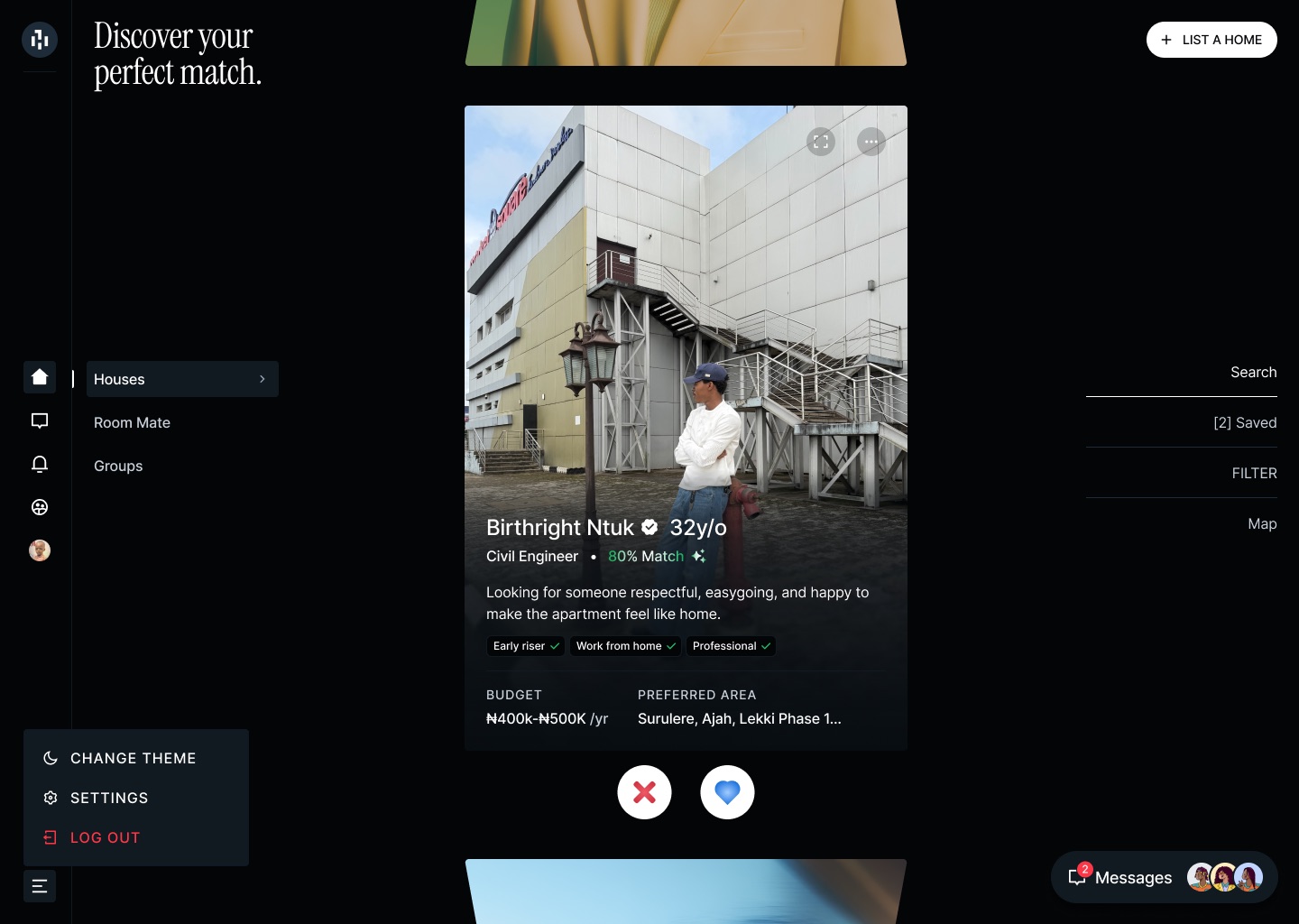
x = 515where the card's centre sits, as designed
39.06%down the screen, where the menus all start
24 · 6pxtag height and corner
213pxmenu width, 16px from the sidebar
250 × 56the Messages button
24pxright-hand menu from the edge
Anything I hadn't drawn, including every phone layout, was worked out from the system's rules and sent to me to approve. A few differences from the design are deliberate: there's no star rating on homes, because we have nothing honest to base one on, and no Marketplace button, because that feature isn't built yet.
Decision 08
Design for trust
These rules matter more to me than any corner radius, and they live in the same rulebook. A match score always shows its reasons. A verified badge means one thing only. "Available" always says who said so, and when. The demo uses the real scoring logic.
100% matchAn estimate, not a promise
Compares location, budget, timing and lifestyle only. It never reads age, gender, religion or ethnicity.
Status
From 01/11/26Agent confirmed 17/10/26
Badges
Halima Yusuf
Hover the badge: it means a government ID check is complete. "NYSC" is a plain label with no tick, because we don't verify it. A green tick on a tag means you answered the same way.
Weights from the real code: location 35, budget 30, timing 15, lifestyle 20
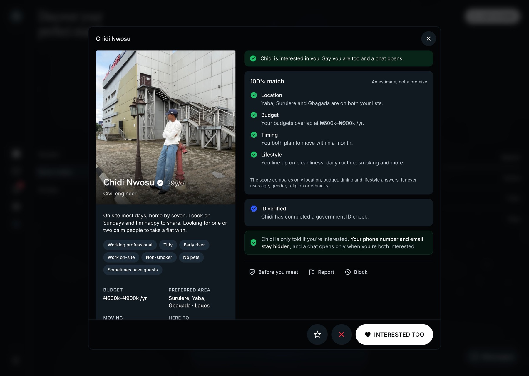
- Contact details are never shown. Showing interest is visible to the other person; passing and saving are private, and every action says which it is.
- No fake proof. No invented stats, and no sample listings presented as real ones.
- Don't over-explain. I removed the green privacy notes from every screen. The protections are still there; repeating them everywhere didn't make them more believable.
- Stock photos are only for sample data. They're credited, and they'll be replaced by members' own photos before launch.
Decision 09
Write down why
Building the system was the easy part. The hard part is making sure it keeps being used the same way, especially when you're moving fast and most of the decisions live in one person's head. In this case, mine.
So I keep a rulebook. It's read at the start of every build session, so a decision I made on Monday still holds on Thursday. Whenever I reject something, the fix goes in, and so does a new rule: the date, what I saw, what to do instead, and where it applies.
"What I saw" is the part that matters most. "Use 12px corners" gets followed once. "Use 12px corners, because 4px with outlines looked too sharp" helps the next screen get it right before I've even seen it.
DateWhat I sawThe ruleWhere
10 Oct4px corners and outlines everywhere looked too sharp12px corners; soft grey fills, never outlinesFields, lists, panels
10 OctThe secondary button vanished on a grey panelOn a grey surface, use the raised buttonButtons
10 OctPhoto and intro competed on one screenOne job per screenOnboarding
12 OctThe main screen only roughly followed my designMy Figma design is the spec; build to its numbers and measureEvery screen
12 OctShadows looked far too heavy on whiteFive shadow styles, softer in light modeShadows
12 OctGreen privacy boxes on every screenNo privacy or verification notesRemoved everywhere
12 OctA grey panel under a photo looked messyText sits on a blurred copy of the photo insteadProfile cards
12 OctGrey panels looked muddy over the sky in light modePanels turn white as the pointer comes closeLight mode
20 OctHome suggestions folded into an animated orbDon't bring an orb backChat
Keeping the rulebook honest
A rulebook only helps if it stays true. Four habits keep this one that way.
- Exceptions get written down too. Almost every rule has a place where it doesn't apply. The sign-up headings are set in capitals while everything else is sentence case, and text on a photo stays white in both themes. If an exception isn't in the rulebook, it looks like a mistake, and sooner or later someone "fixes" it.
- Retired work is deleted, not left lying around. When I dropped the green privacy notes and the Premium page, their code was removed and the rulebook says why. The directions I rejected, like the early group cards and the orb, are recorded the same way, so nobody rebuilds them by accident.
- Nothing moves on without review. The product was built in five stages, from the foundations through to chat. Each one stopped until I'd checked it in the browser, in both light and dark.
- Some calls wait for me. A few questions are mine to answer, such as who reviews reports and how quickly. Until I decide, the product doesn't promise more than it can keep. It only says "we have your report".
The kit
A small set of building blocks
Twenty-two components make up every screen, from buttons and text fields to sheets, menus and toasts. I kept the set small on purpose, so the same pieces get reused instead of reinvented. The examples below are live and follow this page's theme.
Button
TextField · error
+234
Enter all 10 digits after +234, e.g. 803 123 4567.
OptionCard
Chip and Toast
Saved. Only you can see this.
Moments
A calm system earns a few moments
Most of The Hectre is deliberately calm, which leaves room for a few moments of delight. Each one still follows the system's rules, and all of them stay still if you've turned on reduced motion.
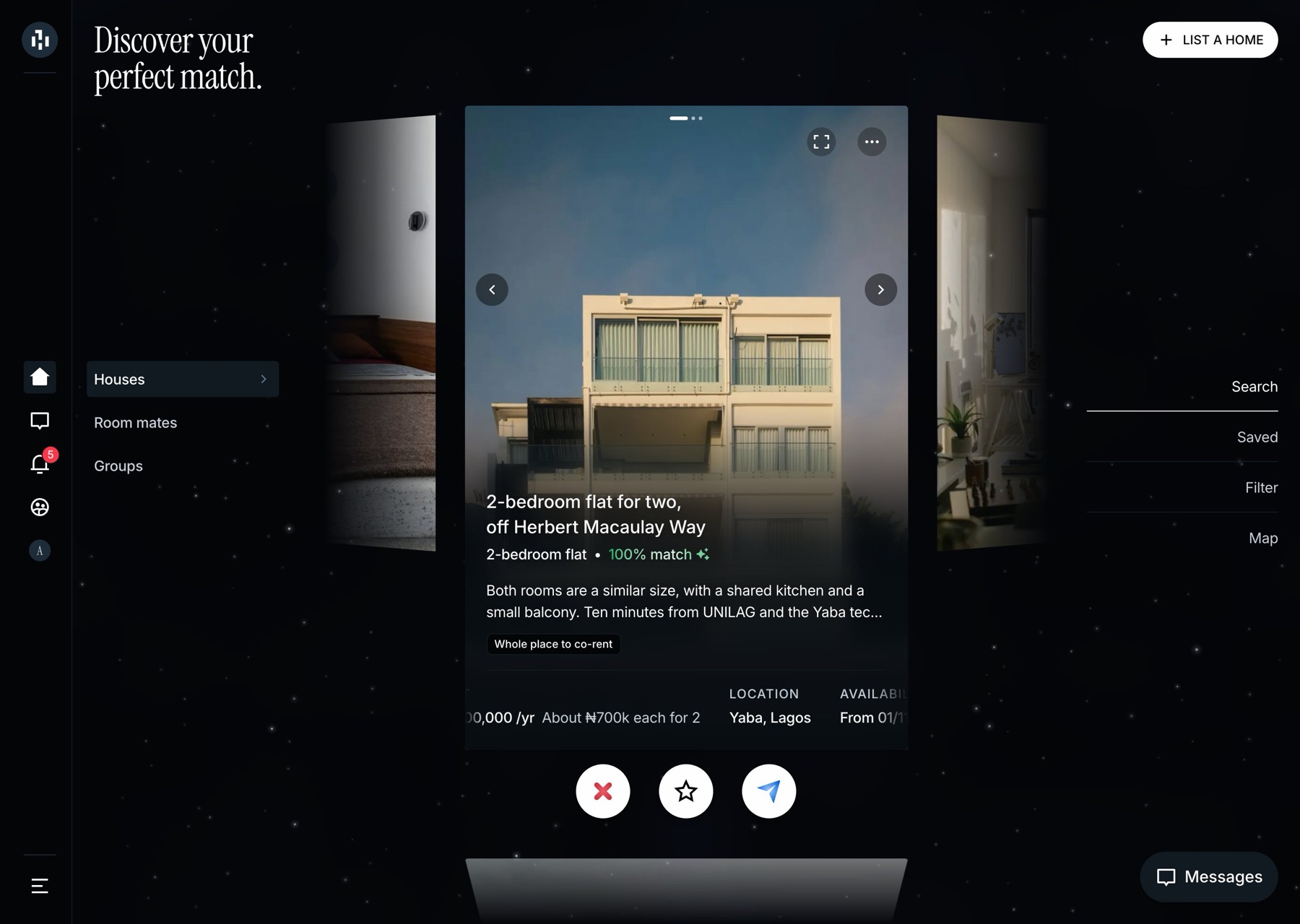
The deck
Scroll up and down to browse. Decisions are always sideways: swipe or tap, and the card flies off that side. A home's extra photos sit beside it, straight from my design.
One shared fade under every photo, and a lift on hover.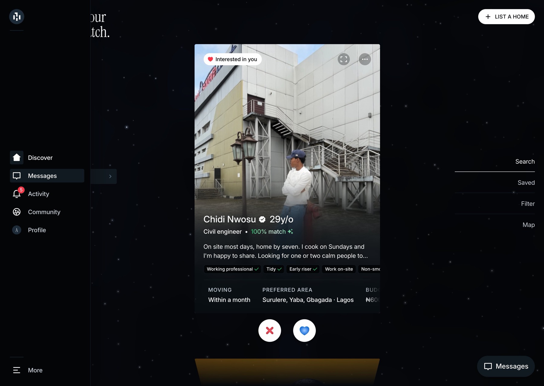
The night sky
A faint animated night sky sits behind the app and brightens around your pointer. It pauses when you switch tabs and isn't shown on phones.
Anything that fades out over the sky stays see-through, so it never leaves a starless patch.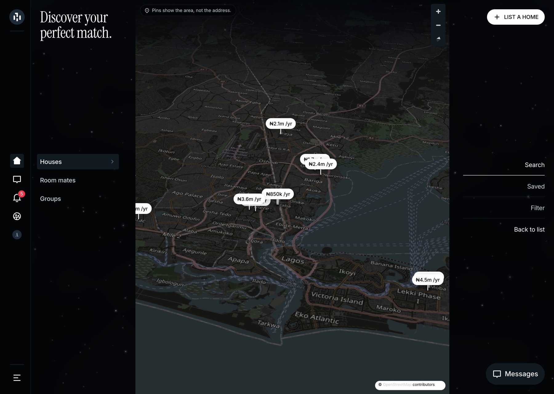
The tilted map
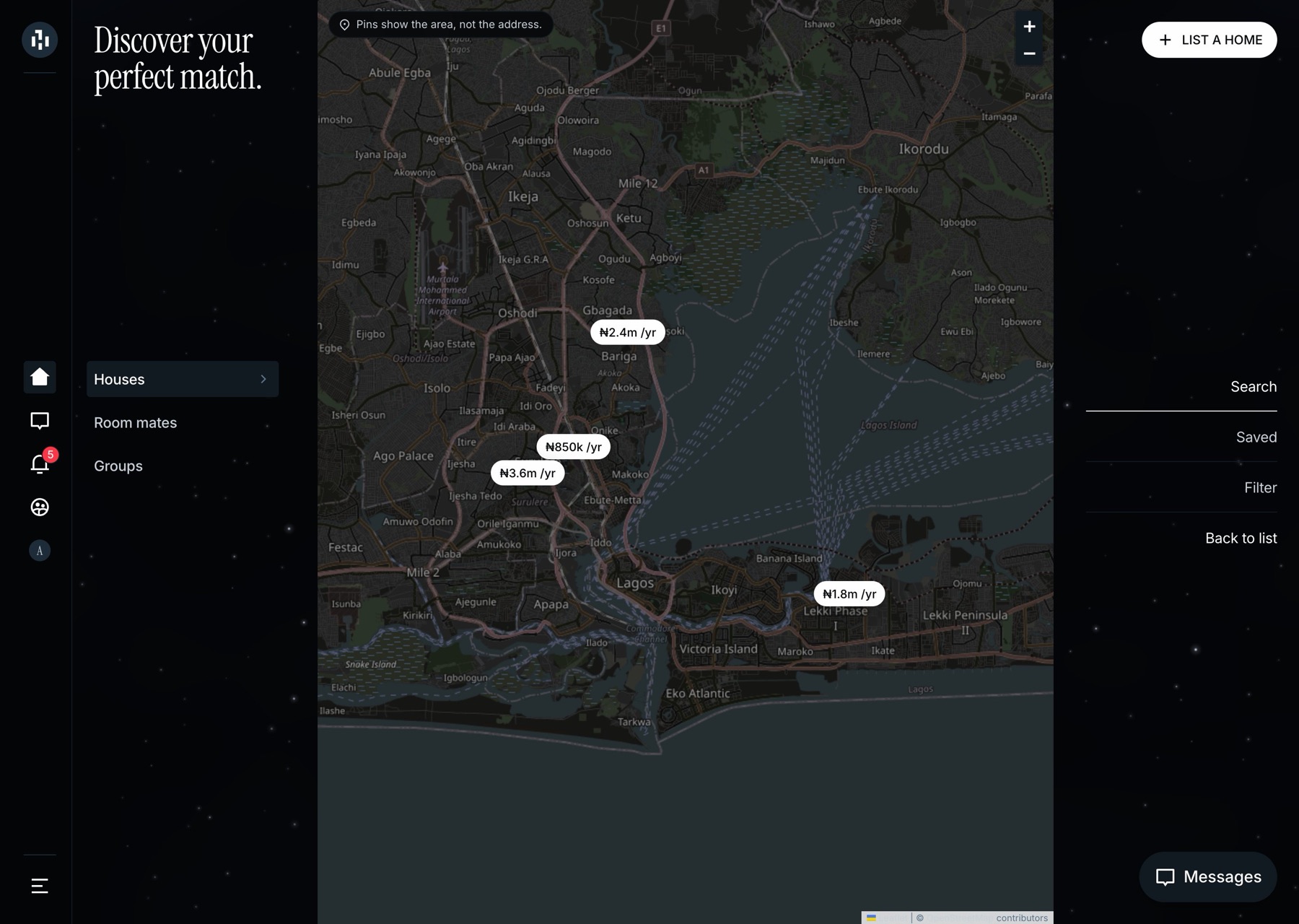
I approved the flat map, then asked for it to feel "3D-ish". Now it tilts back in perspective. Each pin shows the rent and stands on the neighbourhood, never the exact address.
Pins and controls use the same colours as the rest of the app.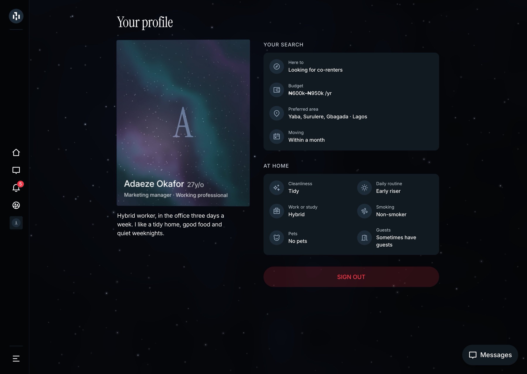
The profile sheen
On your own profile, the photo tilts toward your pointer and a soft film of coloured light follows it, in the colours of the night sky.
Off on touch screens and with reduced motion.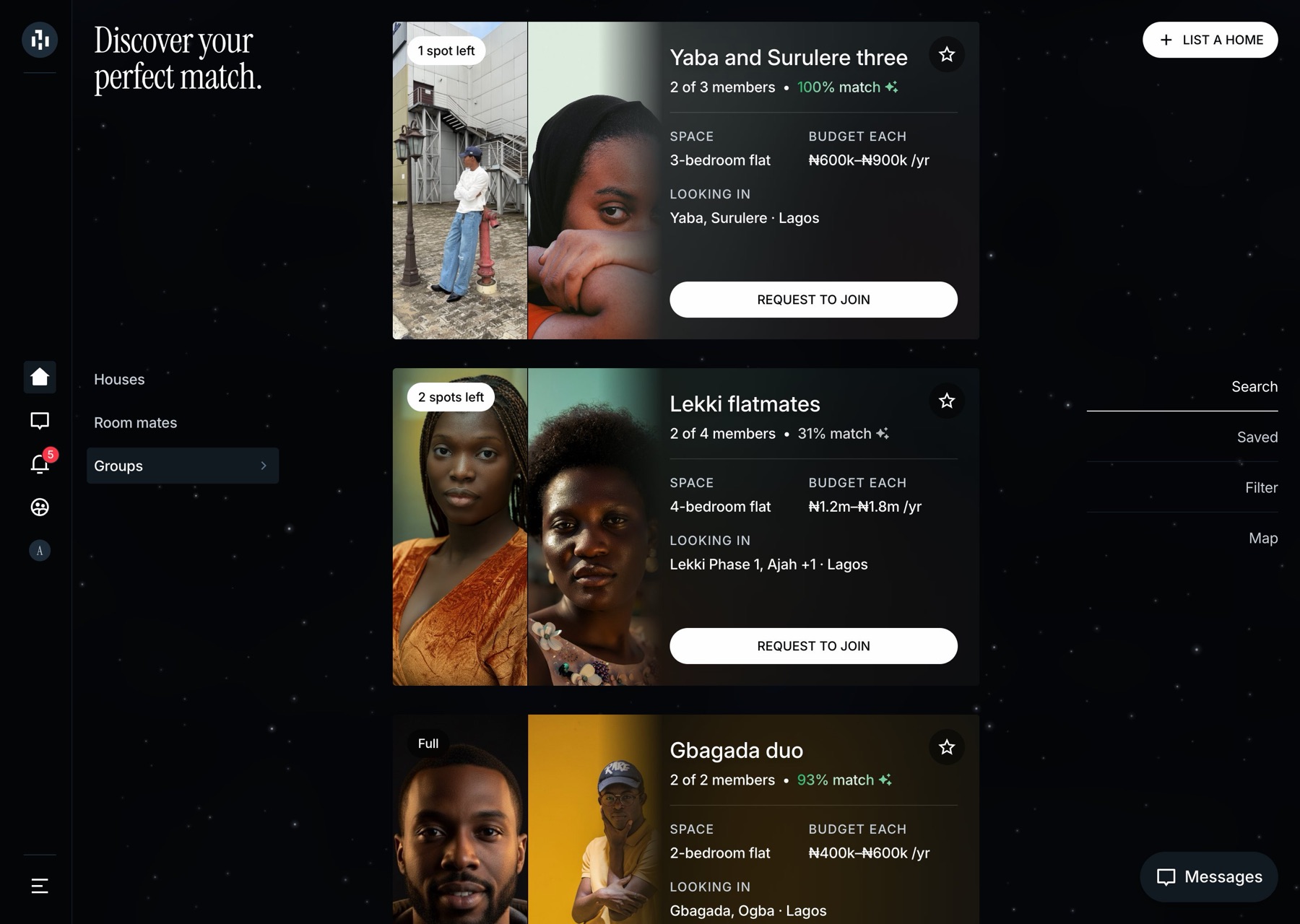
Group cards
Group members appear as a photo grid. Instead of a separate grey panel, the text sits on a blurred copy of the same photo.
The card picks a wide or tall layout from the space it has, not the screen size.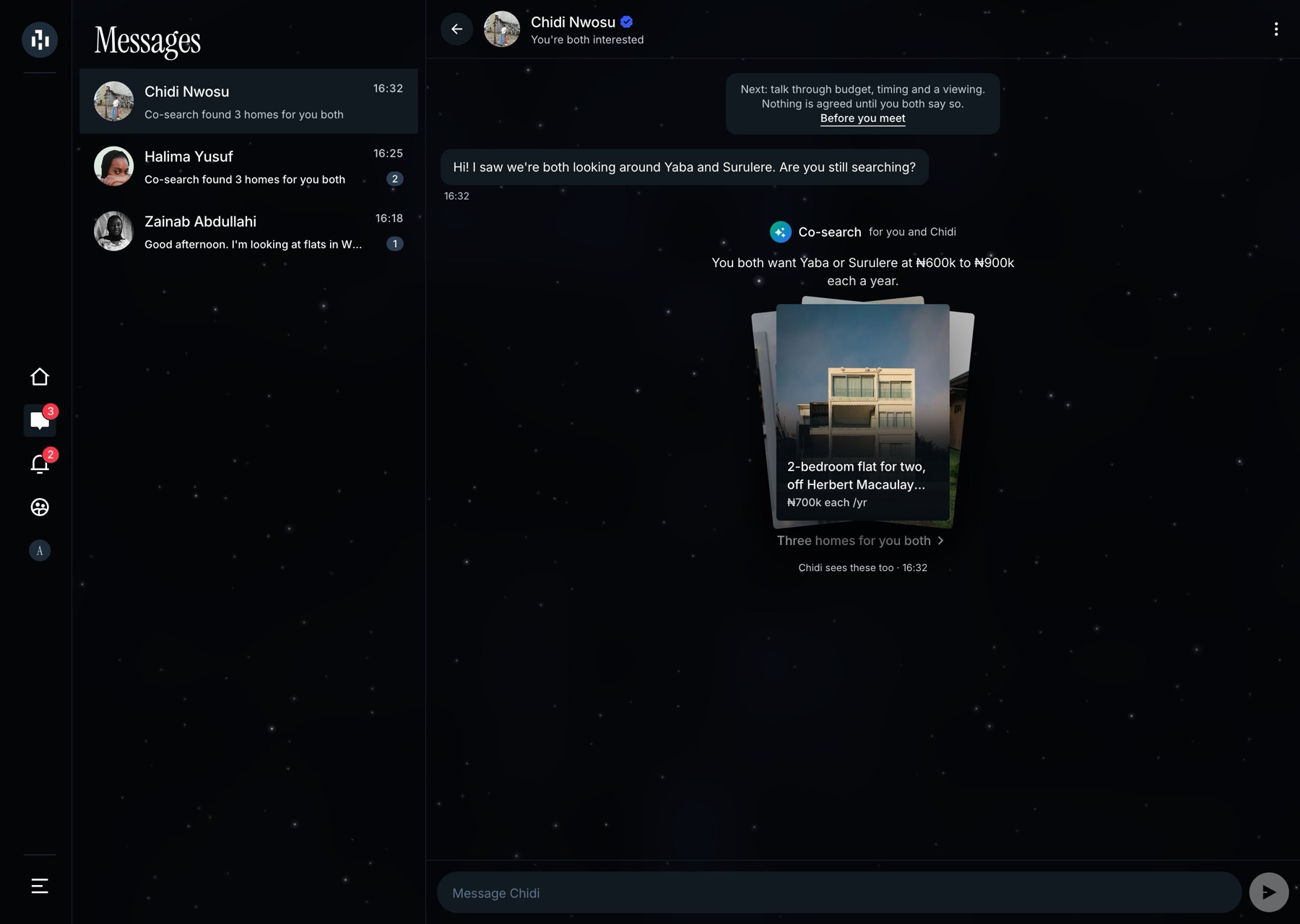
Co-search
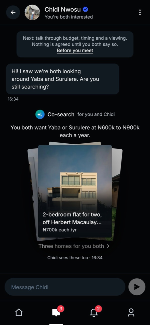
An idea I'd wanted for a while. When two people match, The Hectre suggests homes that suit them both, right in their chat. They arrive as a fanned stack that spreads out when tapped.
What all the homes have in common is said once; a home only gets a label when it's the exception.Before and after
What review changed
These "before" screenshots are real: I ran the app as it was on 12 October and captured them again. Each comparison moves on its own; hover to drag it yourself.
Group cards, four versions
I went through four versions of this card: a two-column grid, my own Figma design built exactly, then a narrow card with an empty column for each free place. My notes at the time were "you can do better" and, less kindly, "weird". The version I approved keeps my design's size and spacing but drops its outlined box. Being willing to overrule my own design was part of the job.
The map: approved, then pushed
My first note on the map was "I love what you did with the map." Later the same day I asked for it to feel "3D-ish". The brief was to keep everything I liked and change the engine underneath.
Notes that said too much
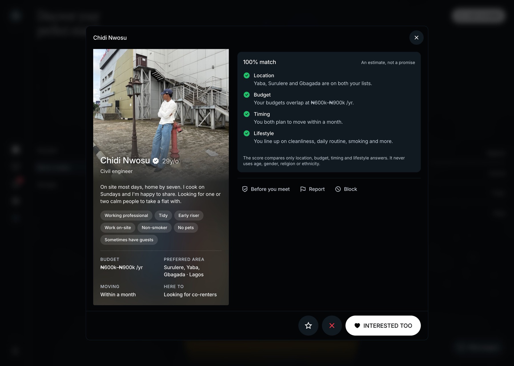
The first version of a profile announced everything: an "ID verified" box, and a green note saying phone numbers stay hidden. I removed them across the app. The badge's tooltip is now the only sign of an ID check, and the screen is calmer for it.
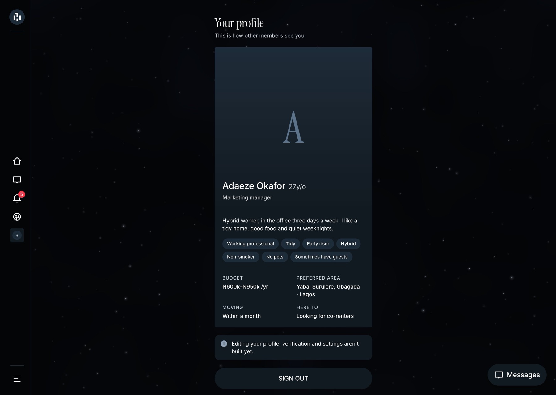
My profile, from a card to a page
The first version of your own profile was just the card other people see, plus a "not built yet" note. It deserved better. Now every answer sits under the question it belongs to, in two panels.
Sign-up: my own rule, reversed on purpose
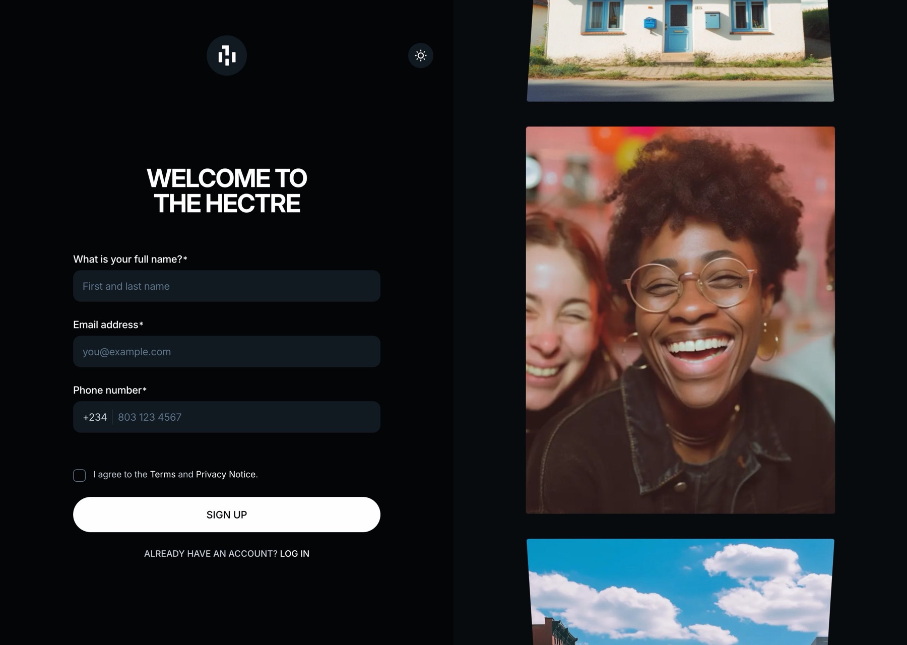
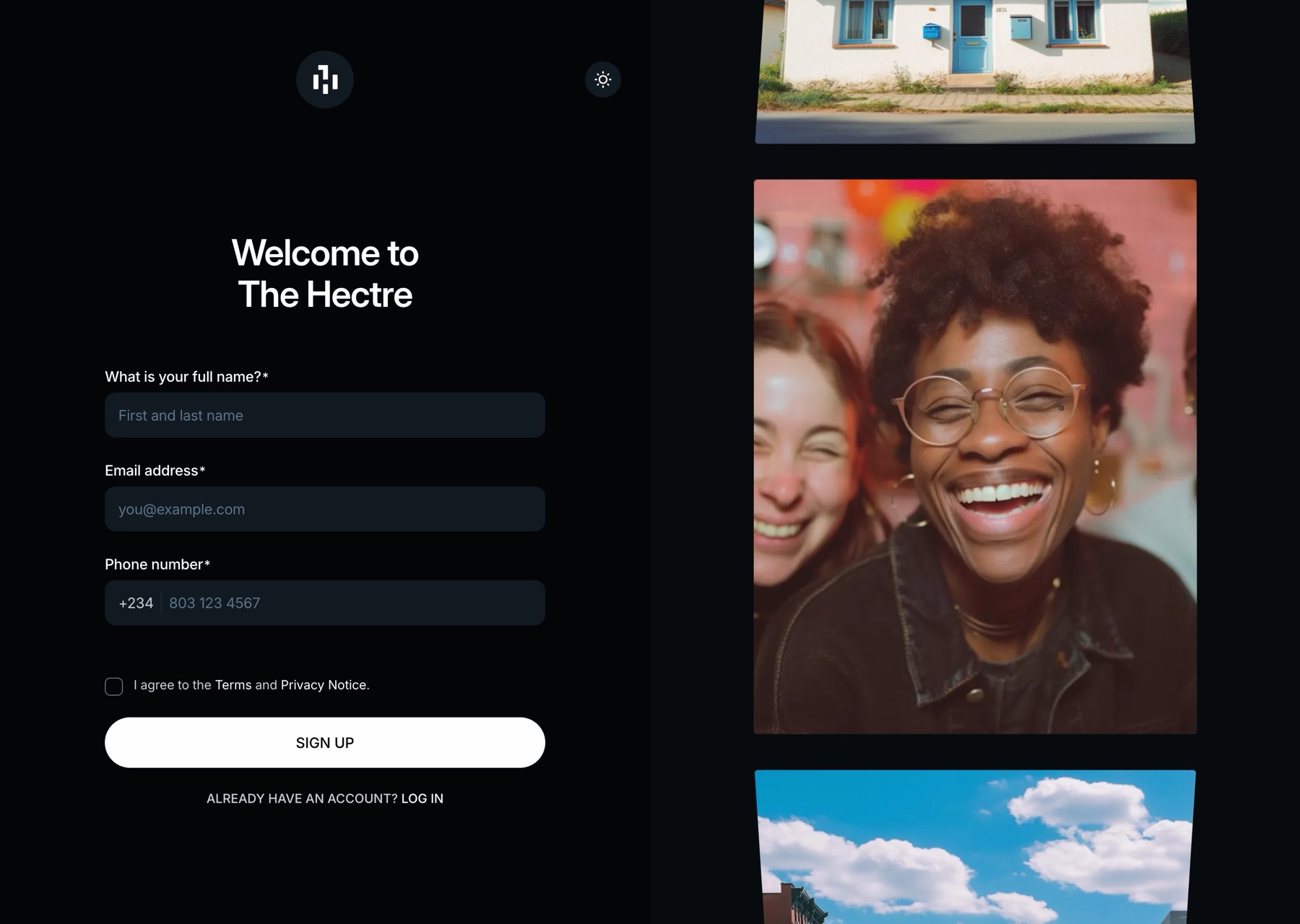
Sentence case was my rule everywhere, but on 12 October I made an exception for the sign-up screens: bold capitals, always split as "Welcome to / The Hectre". A rule you can't break on purpose isn't much of a rule. The form itself stayed short, with no marketing checkbox, so nobody is signed up for emails by default.
- The phone tabs took three tries. A pill-shaped switch, then text-width tabs, then what shipped: three equal columns with a marker that slides between them.
- Premium became Filter. Payments aren't built yet, so a Premium menu item had nothing behind it. I gave its spot to Filter.
- The orb. One version folded the home suggestions into an animated orb. My whole review was "Not a fan of this blob." It's in the rulebook, so it stays gone.
On a phone
Derived, not drawn
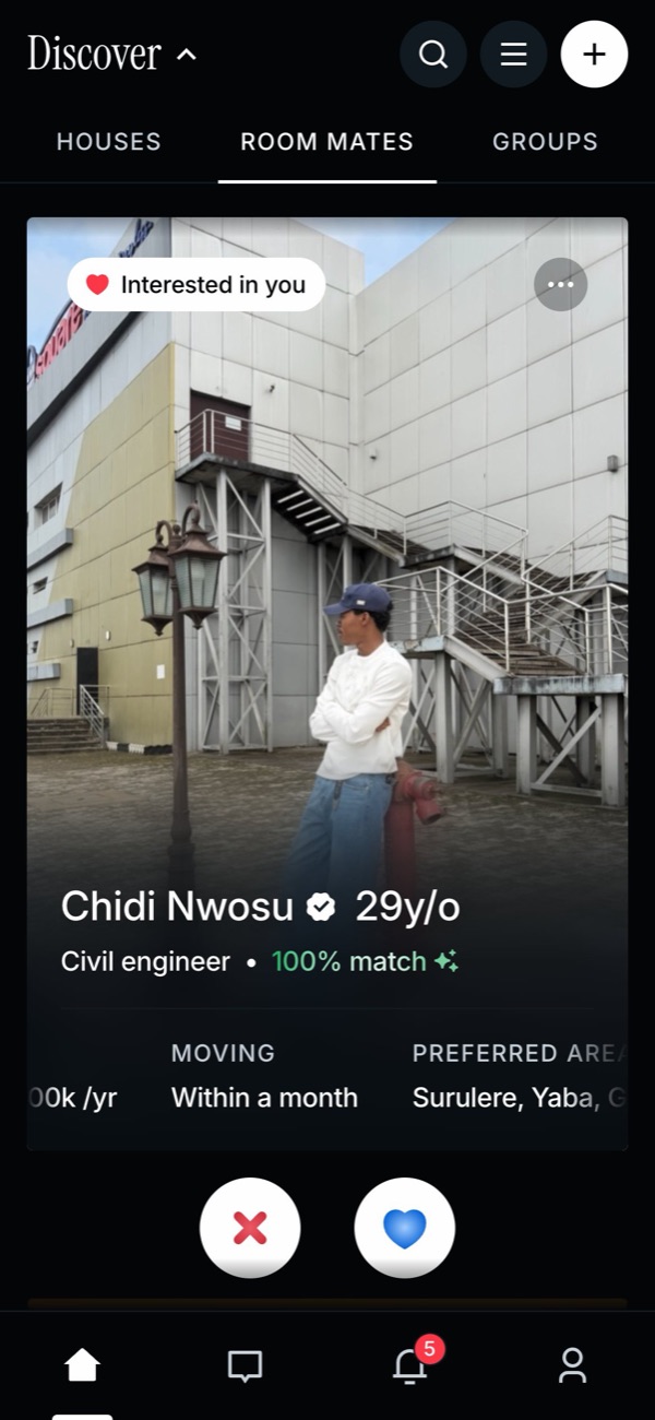
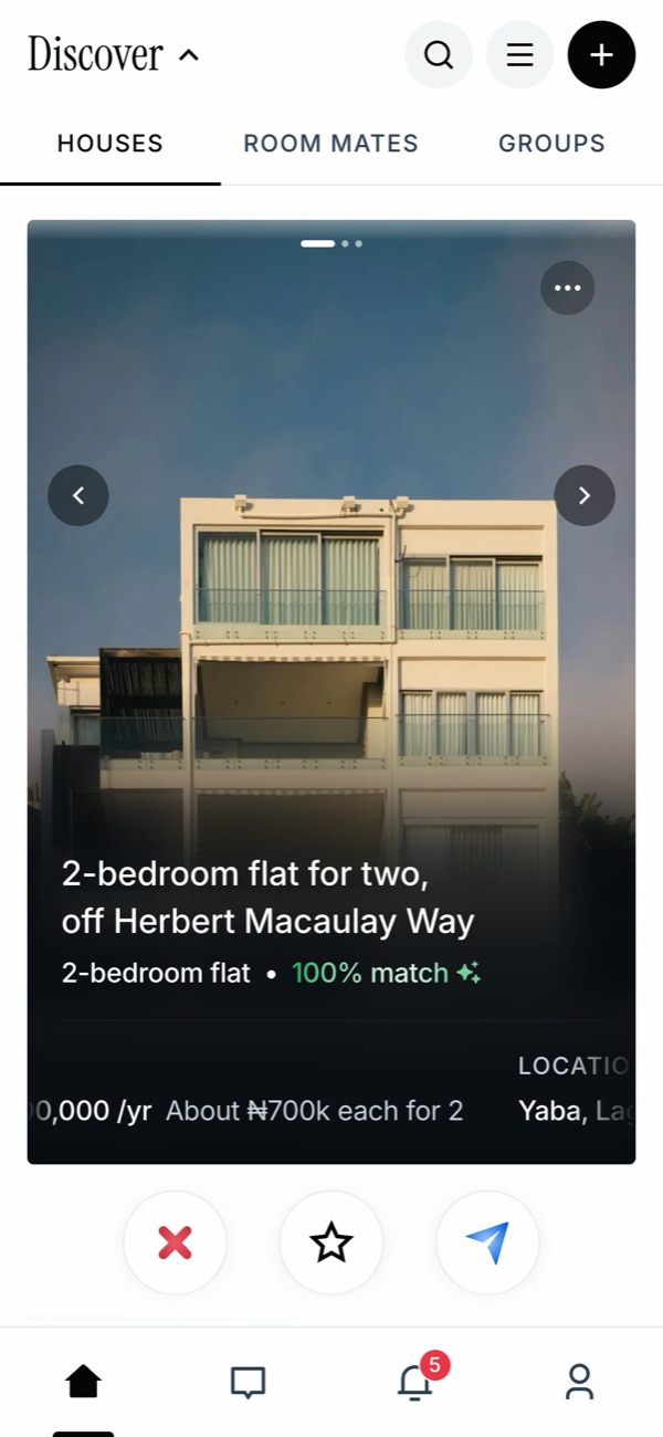
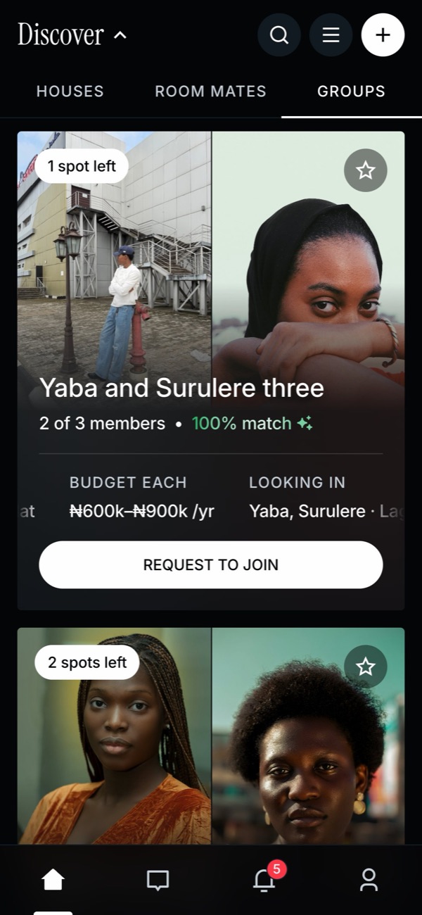
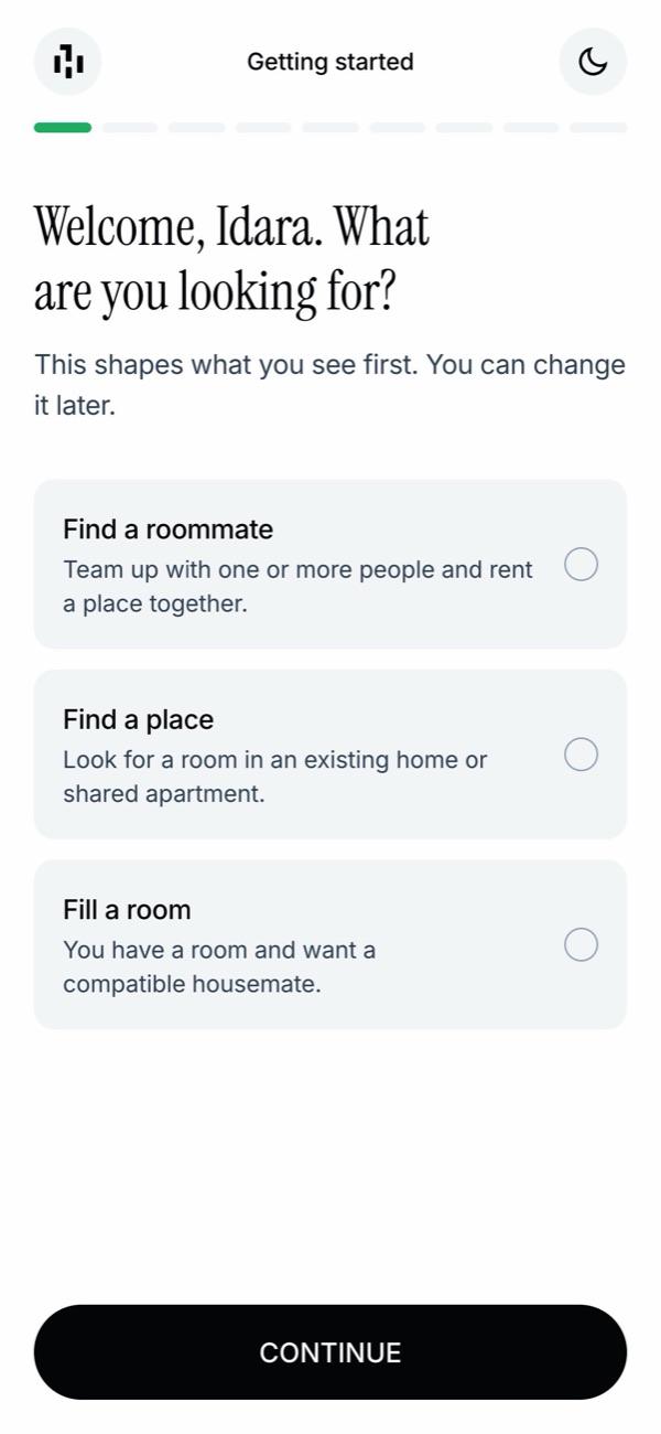
My Figma designs are desktop only, so the phone versions were a real test of the system. Each layout was worked out from the rules, reviewed in the browser, then refined against my own sketches.
Where it stands
What's next
We haven't launched yet, so there are no usage numbers here. What exists is a working product built on one system: light and dark, phone and desktop, with every loading, empty and error state designed.
Next: finish moving the remaining Figma components onto the new system, link each component in Figma to its code, decide on the four leftover colours, and move the map to a production provider. Once we launch, I want to measure trust directly: how often people open the match explanation, how many reports come in, and how quickly a match turns into a viewing.
Write down why
A rule without a reason gets followed once. The reason is what helps it apply to screens I haven't seen yet.
Review the real thing
Nearly every call I'm glad I made (the corners, the shadows, the muddy greys) came from looking at the real thing in a browser, in both themes.
Trust is design work
A badge, a score and an "Available" label deserve the same care as a colour. They're what people lean on when they decide who to live with.